Imagineer Joe Rohde has been taking Disney fans on an online digital tour of Animal Kingdom through his Instagram, providing deep backstory on its ethos and culture. He’s discussed the Tree of Life, Africa, Asia, Expedition Everest, and Dinoland USA, but now we’re going off world to Pandora – The World of Avatar!
Joe begins by discussing how two artists greatly influenced Pandora’s design.

“Great artists who have come before us can teach us a lot about how to solve the design problems facing us today. Two artists in particular were key for Pandora, Frederick Church and Gianlorenzo Bernini.
Frederick Church created huge landscape paintings in the 19th century that were basically traveling spectacle experiences, a vast overall composition, full of endless minuscule details….Pandora works just like a Church painting, as a macrocosm and a microcosm. Tiny details reiterate the same message as the big pictures.
Now, Bernini and other baroque artists informed the design of the floating mountains. We wanted to evoke a sense of apotheosis, a word for heavenly lifting up in Baroque ceiling paintings, mainly, but it also relates to the feeling of Bernini’s sculptural composition. Weightless lifting….Bernini teaches us how to create the illusion of motion, and how to make a material that is by its nature heavy, feel weightless….if you know either of these artists, I submit you can recognize the quotations of their work in the design of the land.”
Joe continues discussing the floating mountains in another post.

“This effect is basically a giant sleight of hand trick. First the trick is to bring the mountains to ground at points very far apart from each other and hidden at eye level by other landscaping. Second is that the actual steel that is holding up the mountains is inside those limp, draped vines. Their drapey shape implies that they’re hanging. They must be hanging from the rocks.
It’s like that novelty leash with a collar but no dog. This took a year of going from physical model to digital model to mathematical model to balance aesthetics, engineering and scale.”
Now off for a ride on the Na’vi River Journey to see one amazing Shaman!
“There are dozens of great illusions on this attraction but the combination of robotics, sculpture, costume, and animation makes this figure seem oddly alive. She sings in Na’vi. The lyrics are a very simple ode to the forest. But the performance is very fluid and convincing.
When we were first animating the figure, we noticed that some of the unplanned moments… moments that were actually resets between animation cycles… looked weirdly psychologically motivated instead of like a machine resetting. So we restructured the script to add a second inner monologue like an actor might have, and the thoughts were not perfectly aligned with the lyrics, so the facial expressions were interestingly complex.
This process also reminded us to give the animated figure time to “think” before taking action. This is a game of microseconds but it makes a huge difference. When you control the figure and have written the script, of course you know what is going to happen next. It’s easy to just make the figure do or say that. But that’s not how living persons work. They dither, hesitate, get distracted, and act contradictory. So we were going for that.”
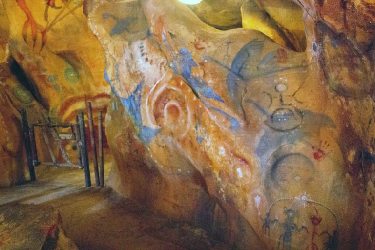
And before we conclude our tour, Joe takes us for a Flight of Passage, starting with the queue.

“There is no cave in the movie, we made it up in collaboration with the filmmakers because we we needed it for several reasons. To bridge the distance from the land to the building. To create shade. And to create a sense of ceremony before the real business of loading an attraction begins. Presumably we all get the pun of Flight of Passage relating to a rite of passage. We actually structured the ride on the arc of real rites of passage… Disorientation, challenge, revelation, and Release.”
Joe finishes up by explaining why every flight has something new to see.
“One of the peculiarities of this attraction that makes it different from a film is the need for universal focus. Clearly there is a focal object, the guide, but anyone in the experience can actually look anywhere … and if they look, there needs to be something to see.
So we divided the screen into nine quadrants, like a tic-tac-toe grid. Generally speaking the subject is either in the center square or the square just above that. But all the other squares have a sub-categories of interesting things going on in them, so that no matter where are you riding, you’re going to see some interesting extra stuff. And, because the space is so big, if you ride to the far left you may not notice things on the far right and if you ride near the top you may not notice things near the bottom… So there is reason to come back and ride again.
How many people have noticed the annoyed little monkey-critter at the very end whose meal is interrupted by our triumphant landing?”
Make sure to check out Joe’s Instagram for his own pictures and many more adventurous stories.
Featured Image (Left): (C) Matthew Cooper Photography

