The thorough World of Disney renovation project has reached completion. Following several months of closures, and a couple soft opens, the great “Grand Reveal” is upon us in a few days (although it looks to be done as of today). The cornerstone of Disneyland’s Downtown District, World of Disney’s absence was distinctly felt among shoppers, collectors, and browsers, alike.

Was it worth the wait? Well, it depends who you ask. Disney character abounds in places, and not merely on the shelves. An inspiring Sleeping Beauty Castle wall projection, many classic window displays, nostalgia-inducing animation effects, overt historical nods; it might be enough to thrill more observant guests.

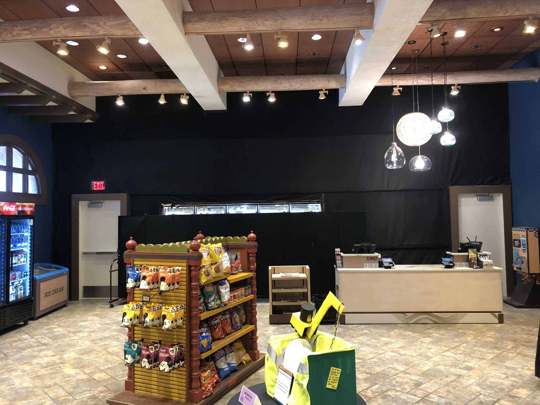
During each phase of the soft open, what was revealed was an open, warehouse floor plan. It’s an arguable improvement over the former, whimsical, but chaotic layout, where one could lose their party simply by blinking. The bare-brick interior showed a want of character and expected Disney creativity. The Grand Reveal at least shows a few more details.

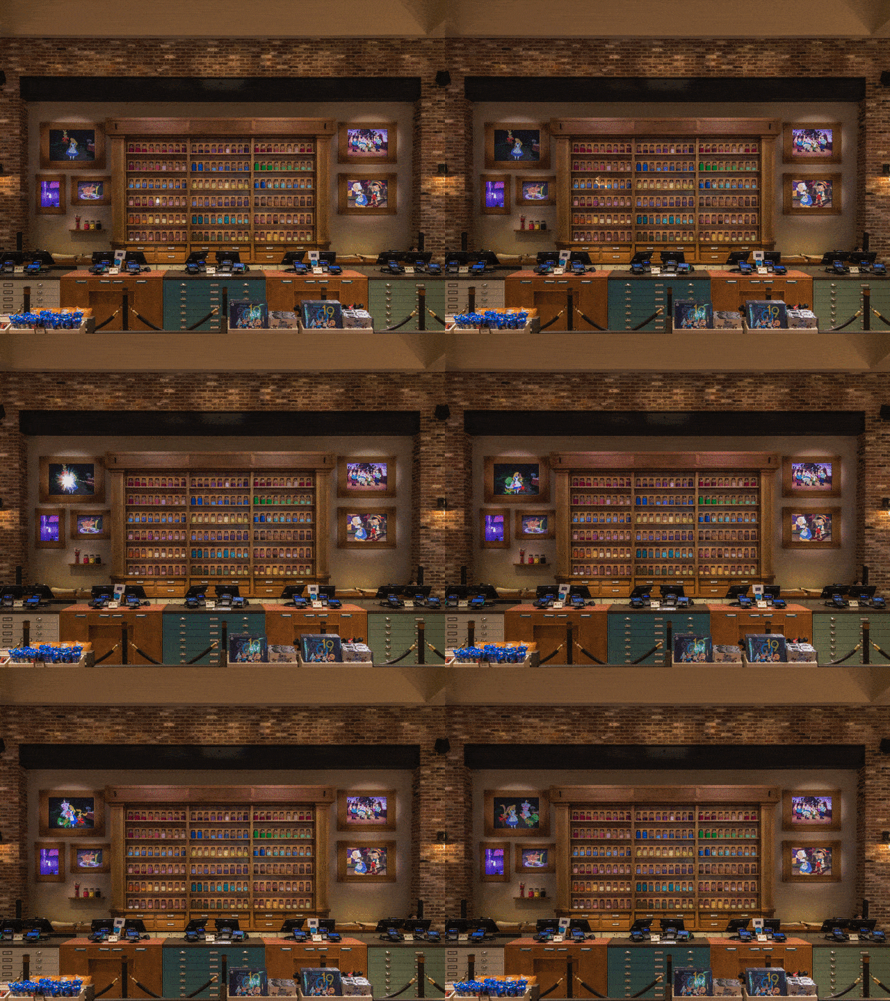
With a clear homage to classical Disney animation, and specifically the Nine Ole Men, the new World of Disney conveys a story of historical longing on its many facades, alcoves, pillars, nooks, and displays. Artist renderings, creative lighting, animation that comes to life; World of Disney is still much more than someplace to become separated from your family and life savings.

Mostly still separated into departments, guests may find all the hats, mugs, toys, clothes, stuffed animals, Star Wars merch, and housewares they desire.

The entire central third of the store is, already, dedicated to holiday items. Because of course.


A lot of the store’s decor is projection-based now, allowing it top change with the seasons and items that roll through.

The new World of Disney, along with its Disney Springs sister store, “Grand Revealing” soon, embrace a future of subtlety with a characteristic nod to Disney creativity. Still just a store, perhaps. Get caught in any of several apparently incurable pinch points or checkout lines and you will witness, hopefully appreciate, the effort.


But why did they have to get ride of the cool sign? Especially when they replaced it with a boring old humdrum sign. Meh.
Interior sounds like an improvement but it’ll be a while before I’m not salty about the signs.