[Editor’s note: This is a guest post by Max Krieger. Max is a Cleveland-based game developer and self-proclaimed “design dork with a thing for artificial spaces.” His current project is a new puzzle game called CROSSNIQ which he describes as “like a cross between Bejeweled and a Rubik’s cube.” Check it out at crossniq.com!]
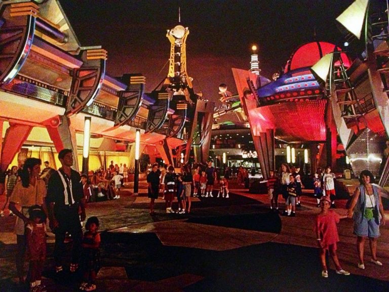
So it sounds like Disney is gonna visually overhaul Walt Disney World’s Tomorrowland in the next few years. I’m here to tell you why that’s BULL**** and why the 1994 take on Tomorrowland is one of the most visually compelling places in ANY Disney park, despite Disney’s haphazard changes since.
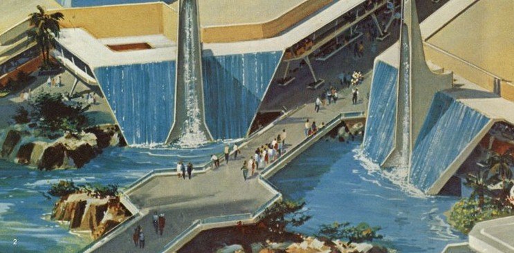
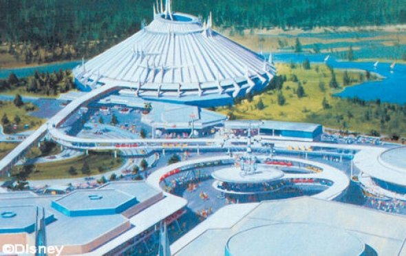
First, a little history. Tomorrowland, one of the 4 themed lands at Magic Kingdom in WDW, originally looked like the classic Disneyland variant – a lot of concrete work, Jetsons-like architecture, and themes like the US space race, automation, etc.
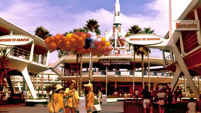 It aged. FAST.
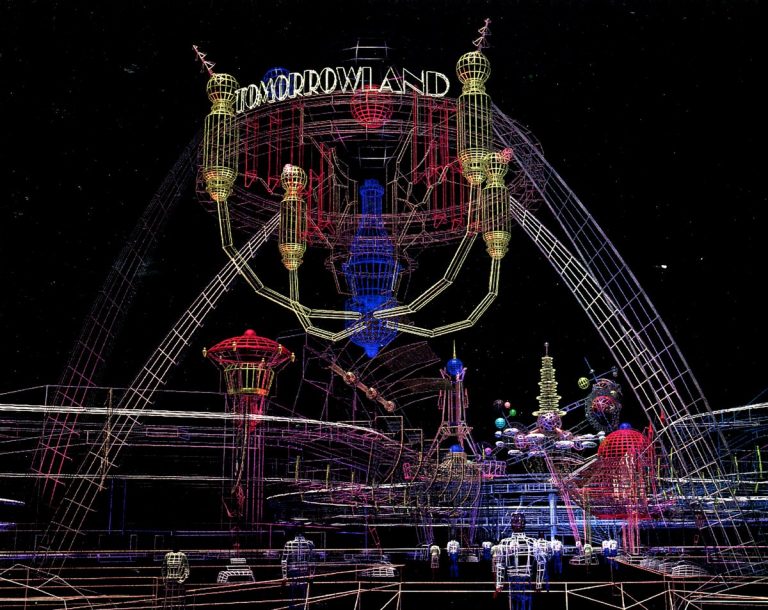
With EPCOT having an entire section dedicated to future tech, Tomorrowland was looking dusty by the early ’90s.
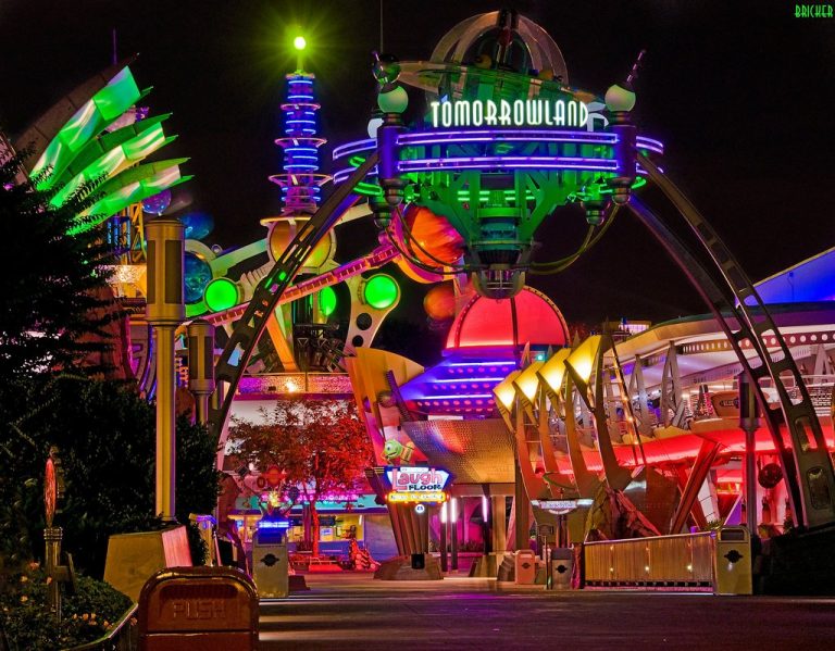
Then, some genius Imagineers went, “Let’s make it look like an art deco industrial future with influences from Star Trek: The Next Generation and Factory Pomo design,” and IT RULED.
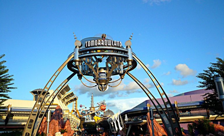
One can easily do a 1950’s throwback design to harken to the golden age of b-movie sci-fi. That aesthetic is practically pre-fabricated at this point, but that is low-hanging fruit. Disney went WILD with 1994 “New Tomorrowland,” inspired by a lot of popular design at the time.
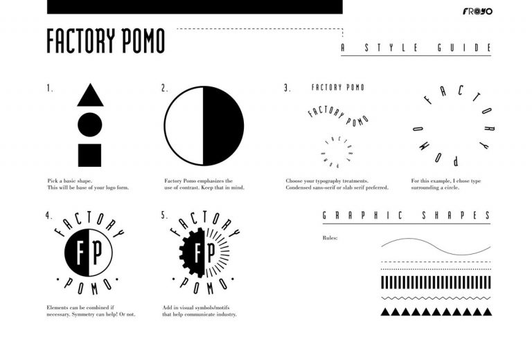
There was a clear aesthetic in the 80’s/90’s, nicknamed “Factory Pomo” in some design circles, that fused art deco design with modern stylization and dynamic typography. 90’s Disney was one of its biggest propagators, and 1994 Tomorrowland was ground zero. (graphic by Froyo Tam)
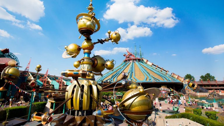
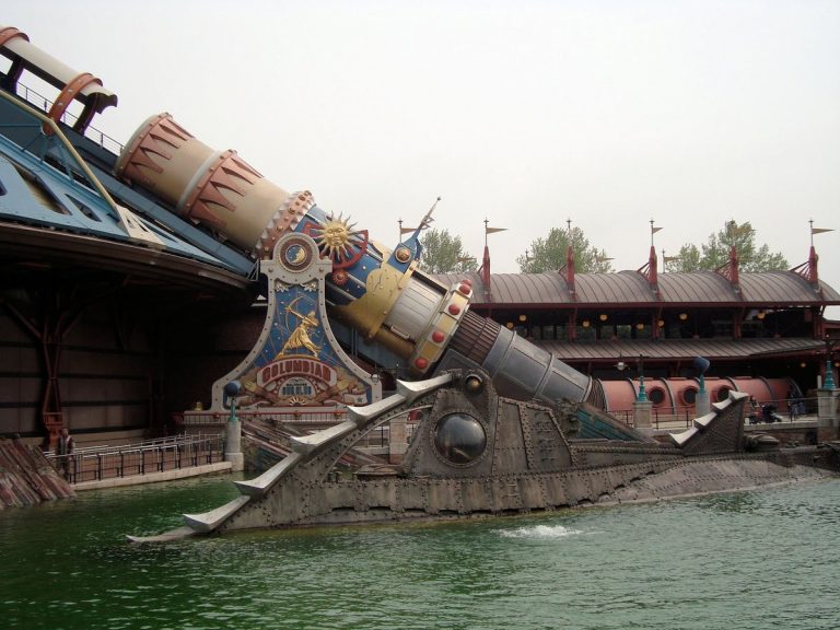
The groundwork for this incredible redesign was largely set by senior Imagineer Tony Baxter, specifically by his work on Discoveryland in Euro Disney – another BRILLIANTLY themed land that Disney has really been bent on screwing up ever since they built it.
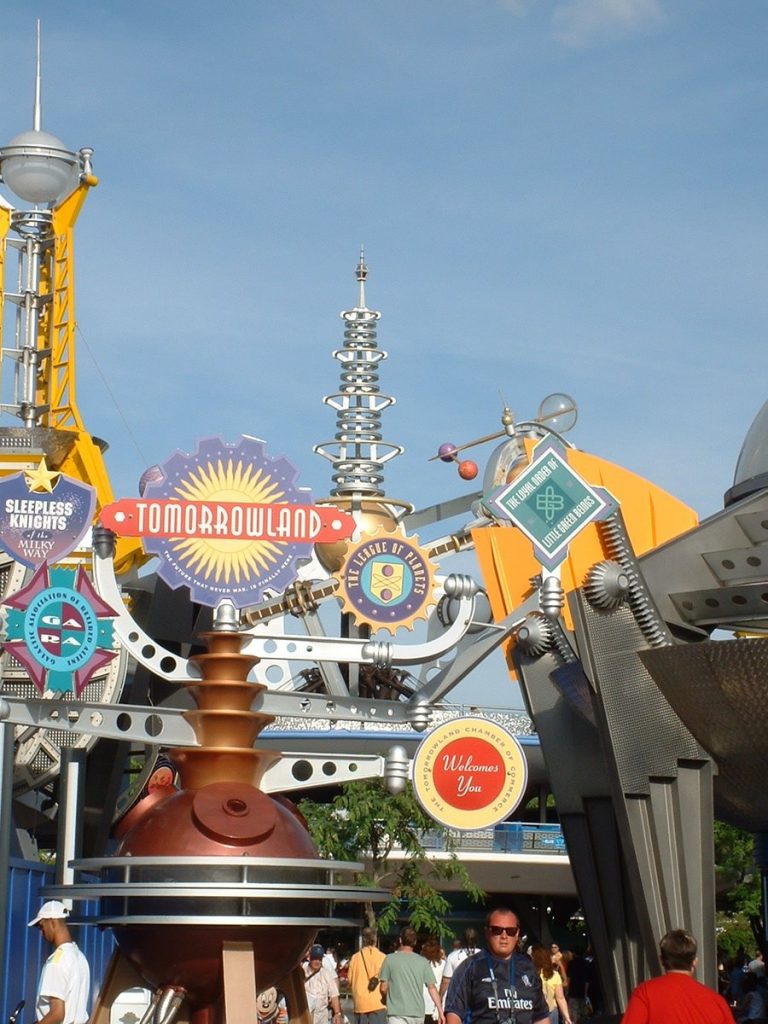
Discoveryland used a steampunk aesthetic and was heavily inspired by Jules Verne, in proper Paris fashion. Tomorrowland 1994 took inspiration from the ornate, retro-future design of Discoveryland, but instead, focused on infusing it with industrial themes.
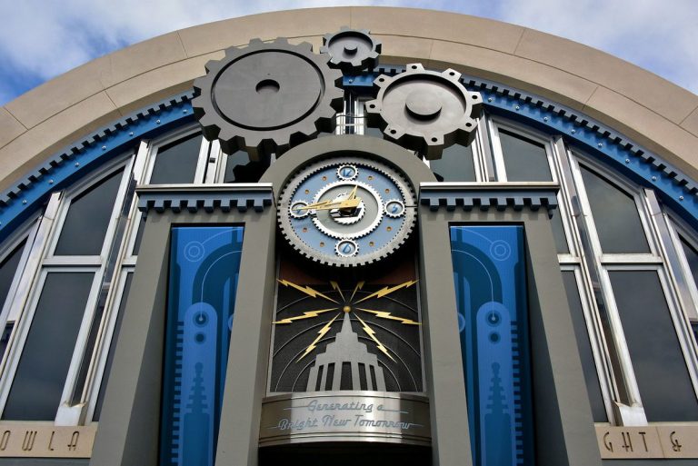
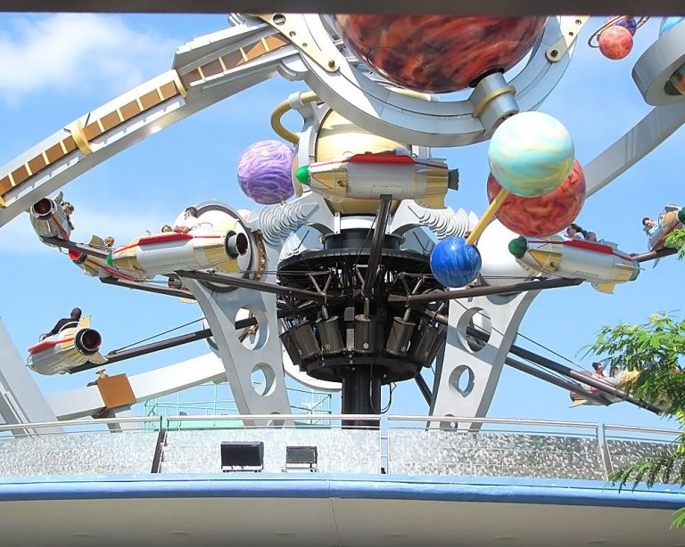
Gears/turbines are consistent motifs throughout the park’s design, as well as art deco facades and columns. Metal supports often had rivets and holes in the rebar, reminiscent of gilded age ironwork, with deco gunmetal colors.
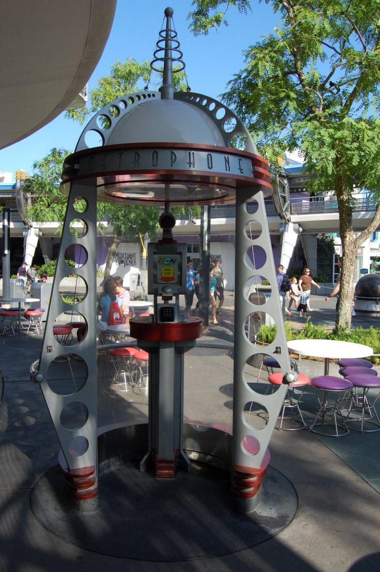
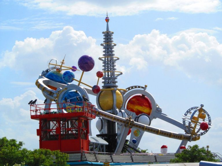
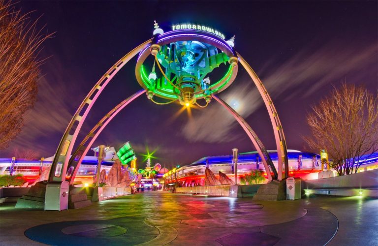
This look was then fused with more colorful and cartoony sci-fi zaniness, with spheres and Jetsons-like rings as accents, all with a teal/purple/yellow/gunmetal color scheme. Together, this formed an INCREDIBLY unique look that went on to influence 90’s museums/science centers/etc.
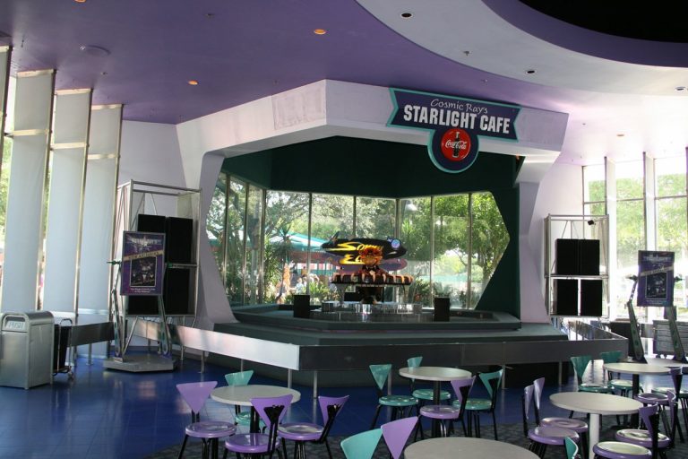
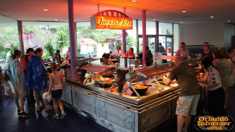
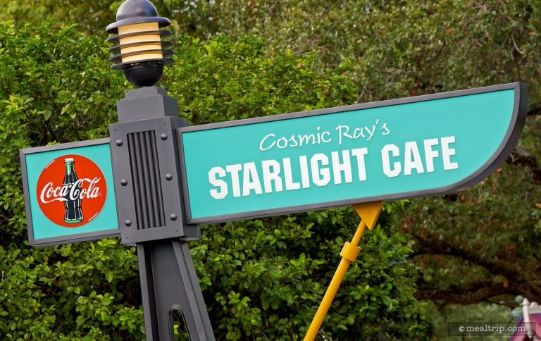
Even atop all this, there was a layer of homage to the 50’s feel of the original Tomorrowland – best exemplified by Cosmic Ray’s Starlight Cafe, featuring “lounge lizard” crooner Sonny Eclipse. The architecture is decidedly “old Tomorrowland” – space age brutalist concrete forms.
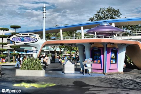
A unique look that captures retrofuturism flavored with something new, all while maintaining homage to the original look and feel – this is probably one of the best rethemings in Disney park history, and the amount of small details really showcase Disney Imagineering in its prime.
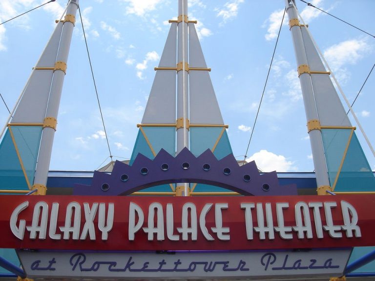
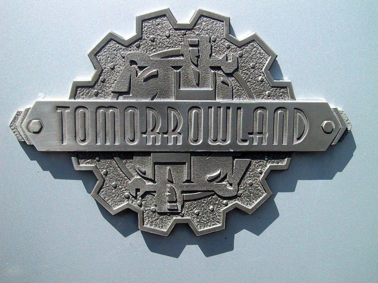
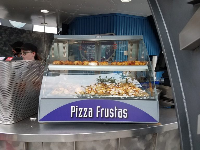
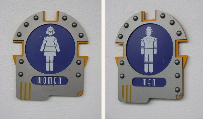
Fonts, for example. The main font for 1994 Tomorrowland was ITC Anna, a popular font within Disney at the time. Subfonts come largely from the Emigre Modula family, with some others. They were INCREDIBLY consistent and used them even down to snack bars and restroom signage.
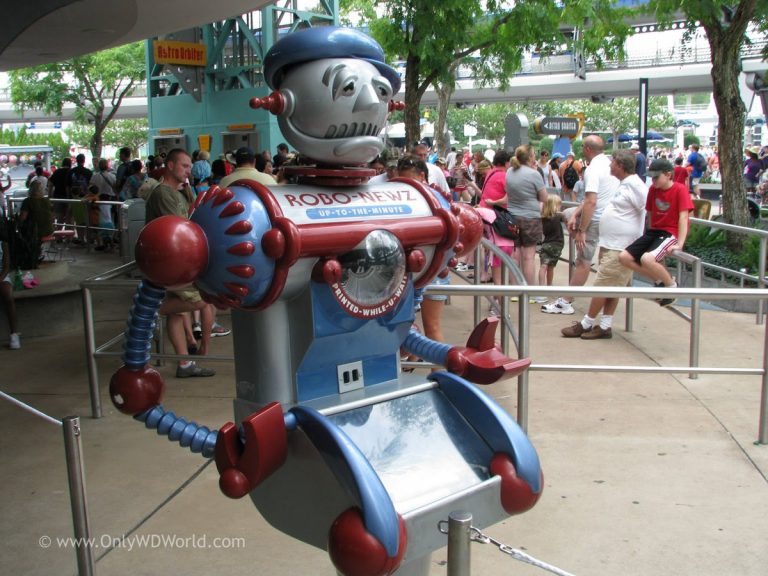
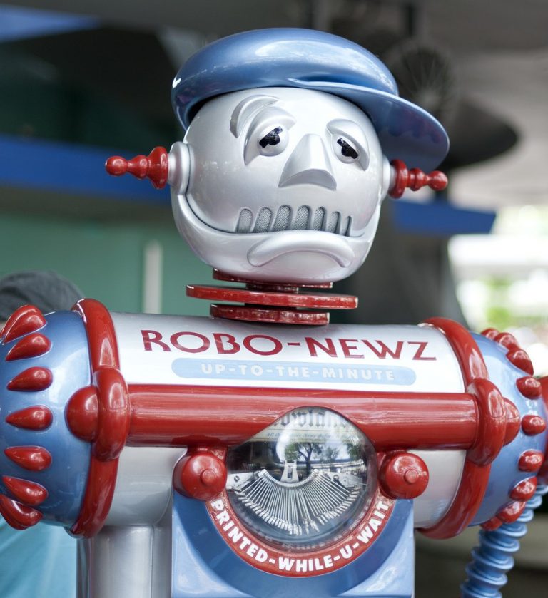
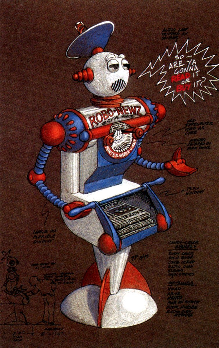
There were tons of semi-interactive tiny flourishes that drove home the “future + art deco + sci-fi + 50’s” melange – this cute robo-newsie, for example, whose design is equal parts 50’s and 30’s, and who would spout funny one-liners at guests waiting in line for the Peoplemover.
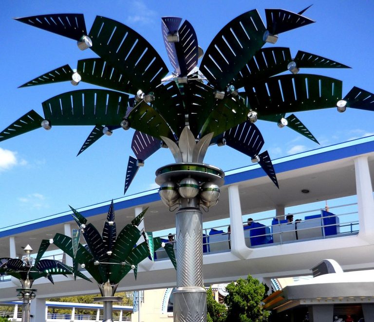
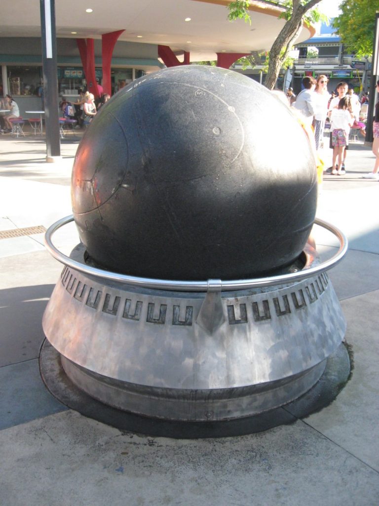
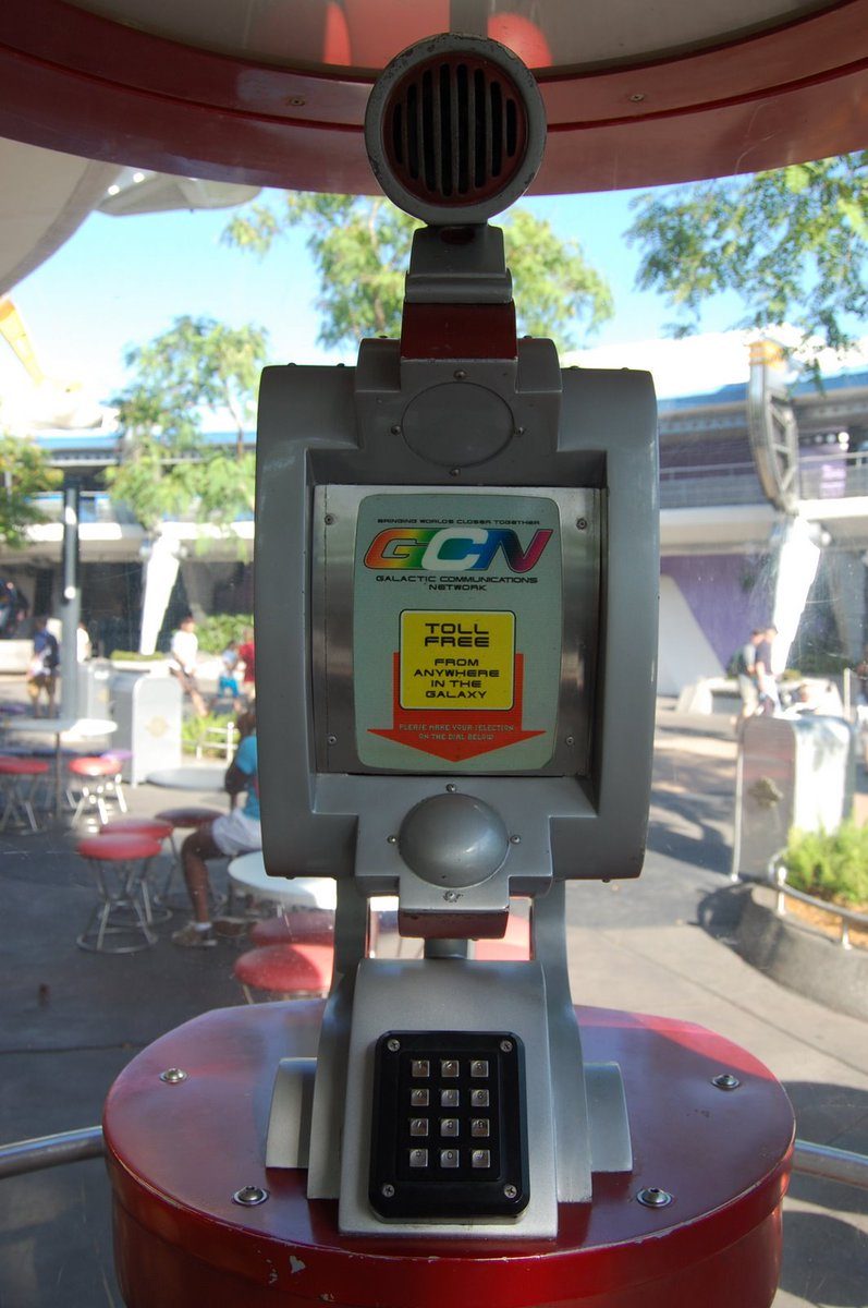
Artificial palm trees, straight out of Sonic the Hedgehog, “open and close”. A Kugel ball fountain, held up on a jet of water, provides an interactive setpiece. An inter-park communication line for cast members is disguised as a galactic phone booth. The detail is SENSATIONAL.
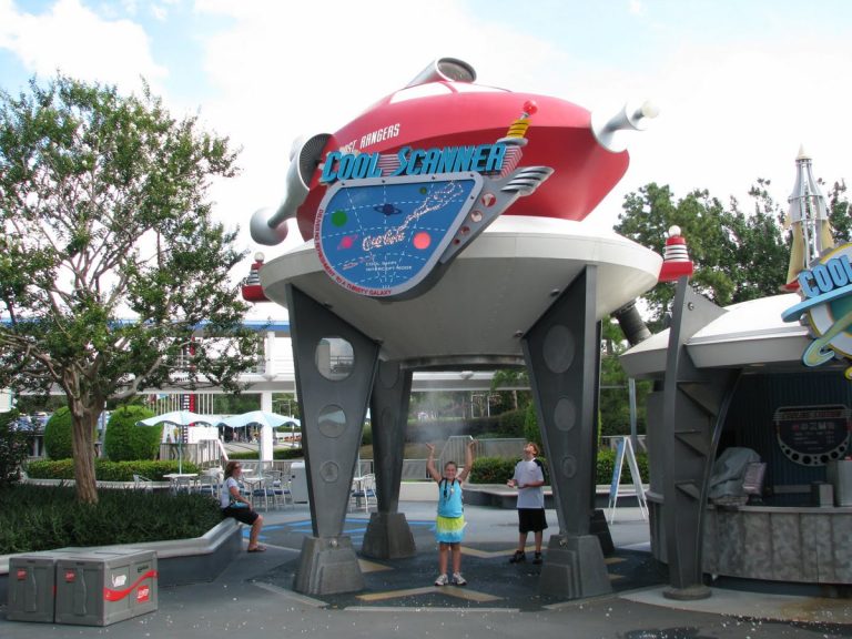
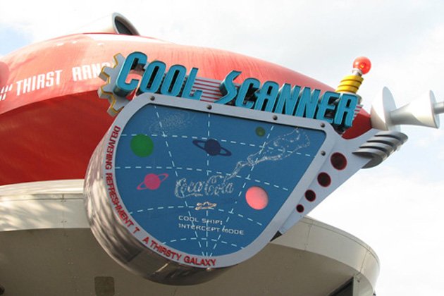
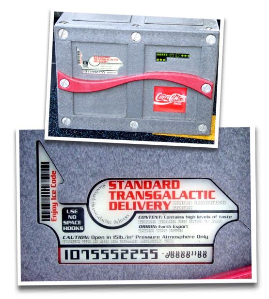
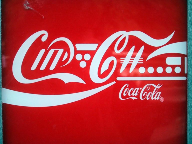
A personal favorite touch of mine – the Coke-sponsored Cool Ship snack bar has “crates” of intergalactic Coke laying around with a CUSTOM ALIEN LANGUAGE COCA COLA LOGO ACTUALLY MADE BY COCA-COLA. this is the kind of stuff design nerds like me DROOL over.
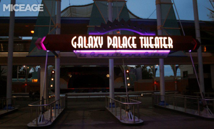
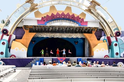
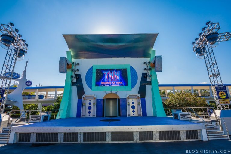
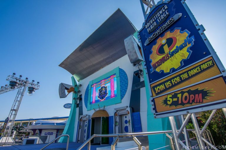
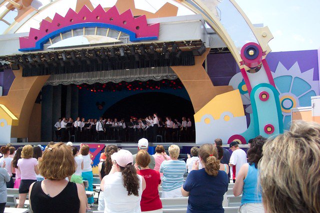
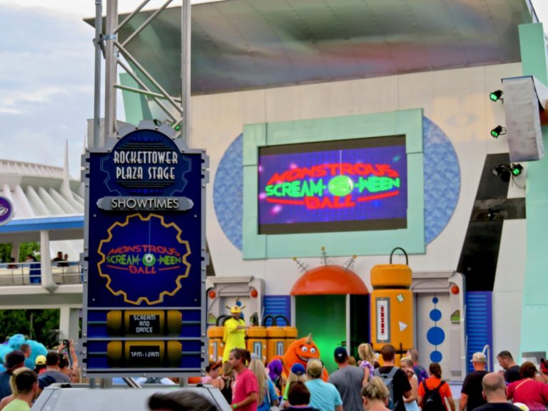
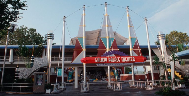
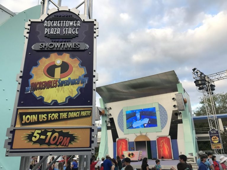
The design of the original 1994 attractions also were held to the meticulous standards of the park theming – starting with the now-demolished Galaxy Palace Theater, replaced with the (surprisingly on-theme) Rockettower Plaza Stage
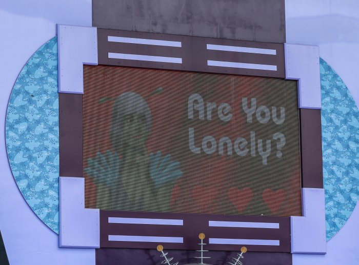
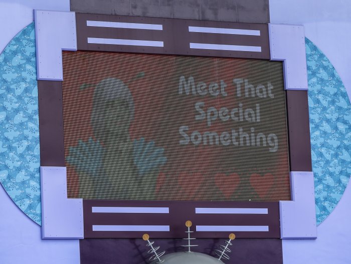
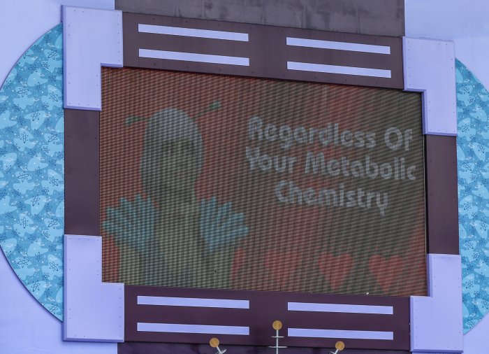
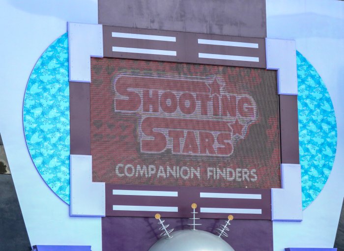
The latter was one of the few post-1994 elements added that adhered strictly to the theming and aesthetic (more on that later…), even going so far as to run Tomorrowland advertisements on its screen to add to the immersion.
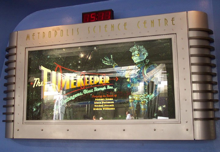
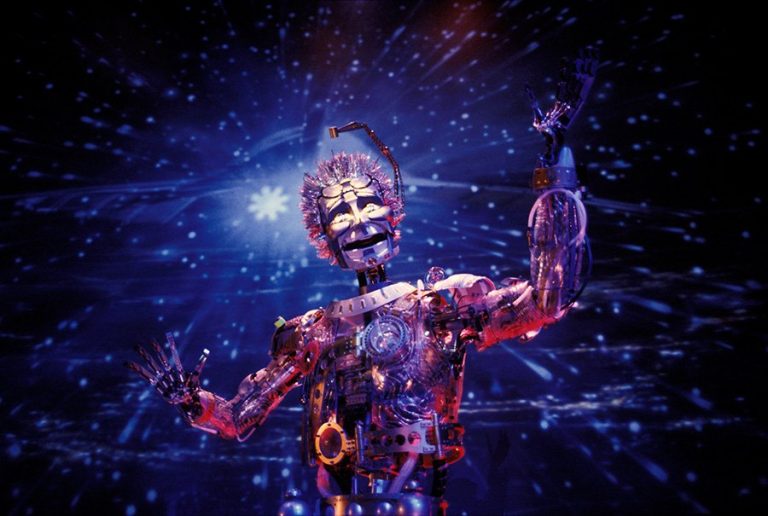
Up next is The Timekeeper, an attraction more or less lifted part and parcel from the aforementioned EuroDisney Discoveryland. This one is dearly missed by a lot of fans, and for good reason – it starred Robin Williams as one of the most lovingly designed Disney Animatronics ever.
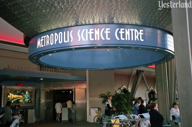
A trip to the Tomorrowland Metropolis Science Center took guests on a journey through time back to meet – you guessed it – Jules Verne. The building and queue itself are so lovingly detailed and cohesive with the 1994 look.
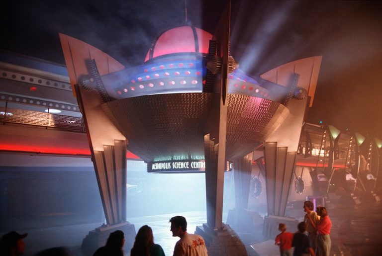
Focusing on this shot in particular (because I love it so much), I particularly like the art deco stepped supports, the circle-brushed metal, and the turbines riding up the sides.
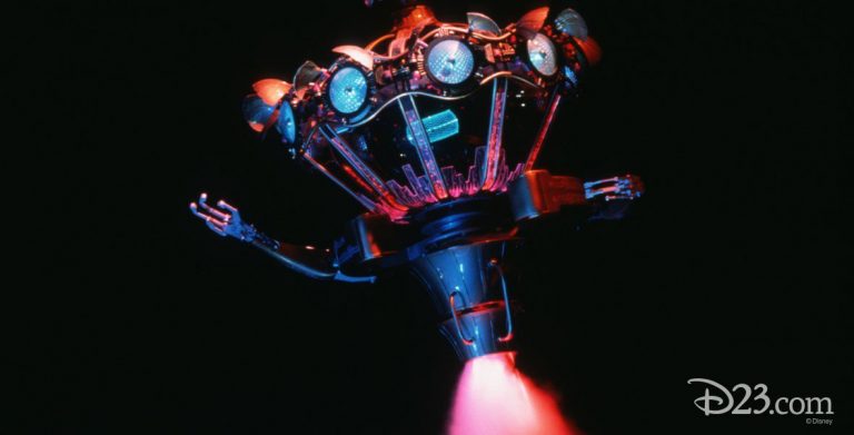
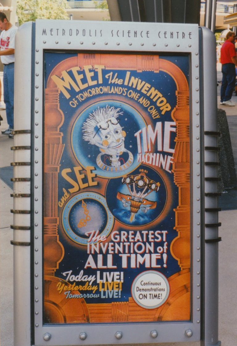
If you missed it, see The Timekeeper in its entirety below:
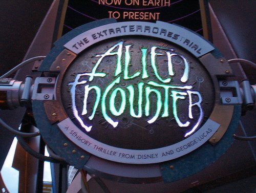
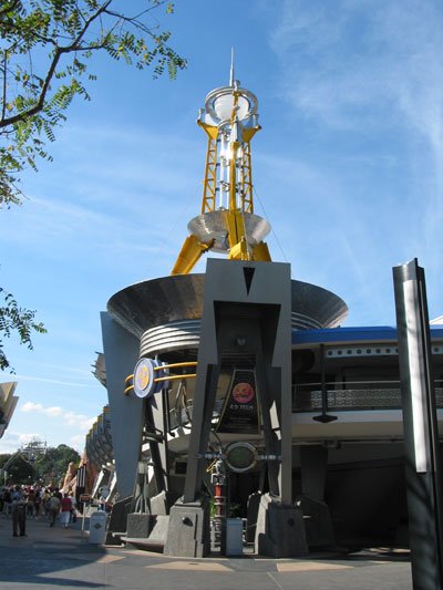
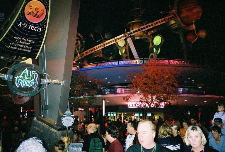
Moving right along, we hit perhaps the most infamous attraction of Tomorrowland – the ExtraTERRORestrial Alien Encounter. The original exterior features an ornate antenna and dish, and is definitely more sci-fi than art deco.
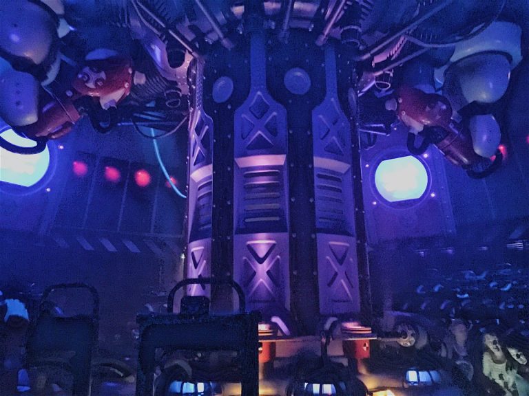
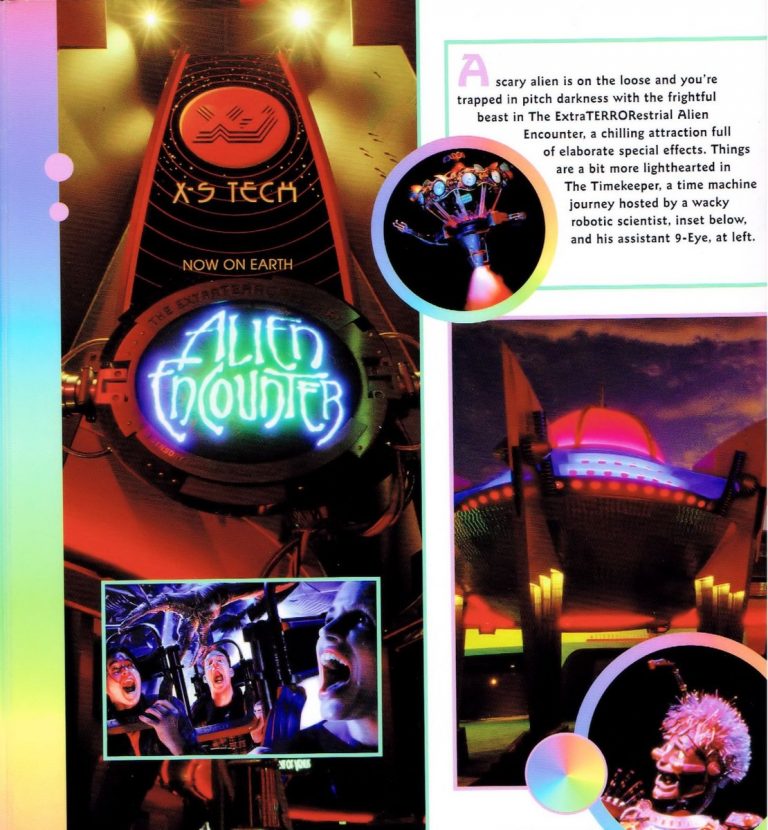
The architecture and interior of the place is very much H. R. Geiger-inspired due to a scrapped tie-in with the Alien license (which Disney had lying around from the Great Move Ride at DHS). This ride was TERRIFYING, and has a famous history (which is covered in a 4 hour long segment you can find here).
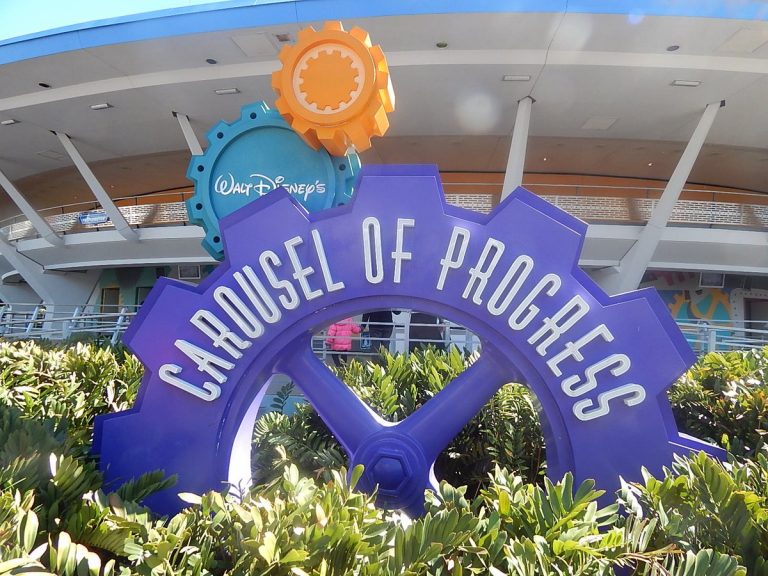
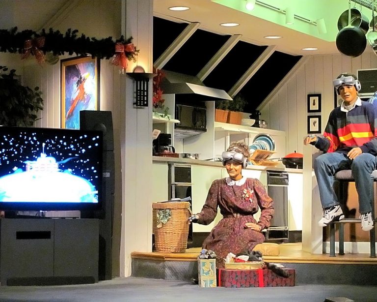
The Carousel of Progress, one of the only attractions still intact in its 1994 state, is perhaps the best fit with the 1994 Tomorrowland aesthetic. Focus on industry and progress is pure Disney futurism. (Admittedly, the “future” as of 1994 is quaintly dated and charming now.)
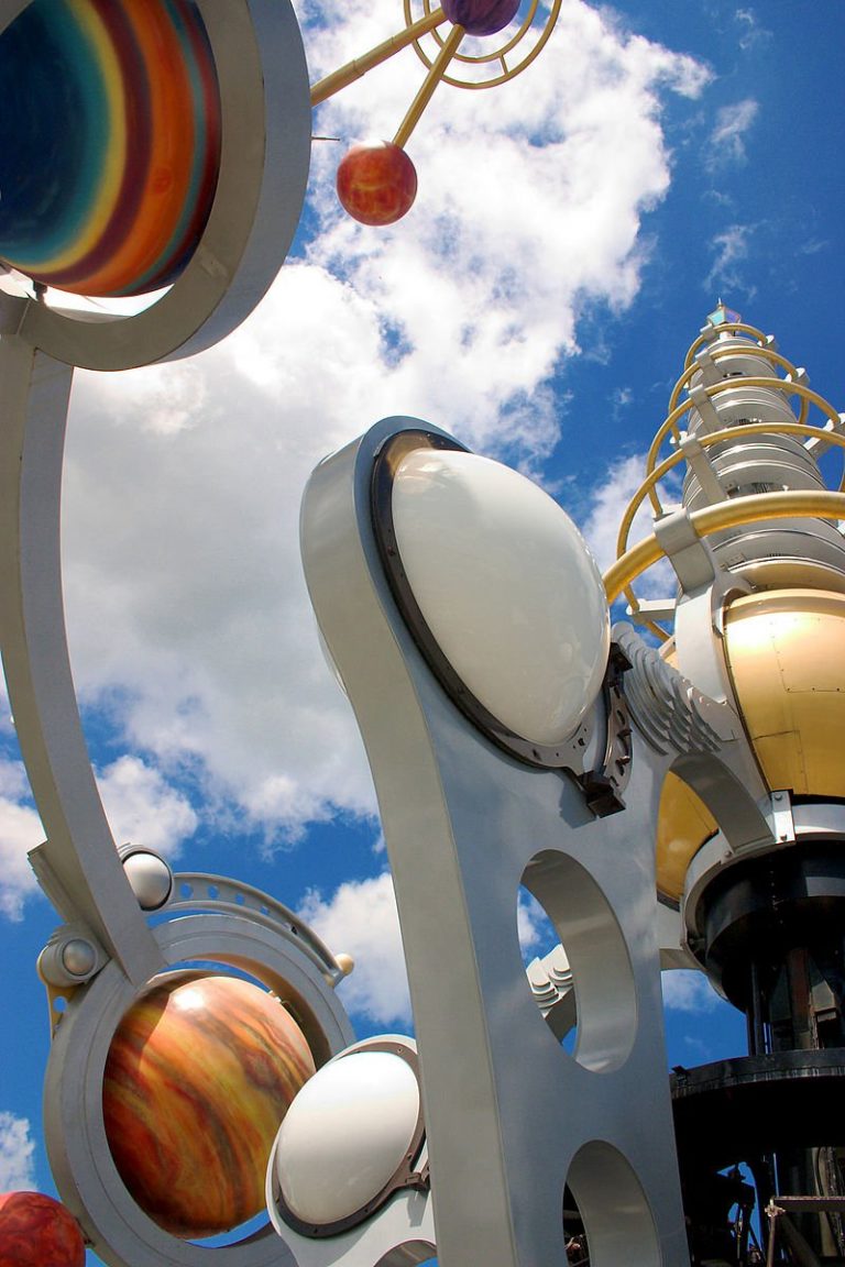
And, of course, the new orrery-shaped Astro Orbiter, to replace the aging space-race era Star Jets. It makes the perfect centerpiece for Tomorrowland – colorful, but with the elements of those art deco/factory pomo/50’s space/cartoon sci-fi aesthetics woven in elegantly.
(I’m excluding attractions like Space Mountain, the Peoplemover, and the Tomorrowland Speedway from this because the 1994 makeover largely left them alone.)
Finally, here are some high-res recreations of logos and signage throughout Tomorrowland (credit to the wonderfully talented Rob Yeo).
You may have noticed some foreboding allusions to post-1994 Tomorrowland here. Let me make something clear – Iger-era Disney really doesn’t give a damn about park theming. It’s depressing and sad so if you don’t wanna see it, tune out now. But here we go.
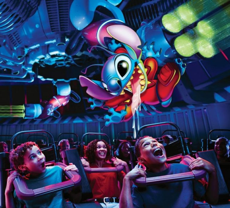
First, the obvious. Alien Encounter is gone. It scared too many kids and upset too many parents (fair), and when a certain alien had a hit Disney movie, the replacement plan was clear. Stitch’s Great Escape took the place of Alien Encounter in 2004. It’s horrible.
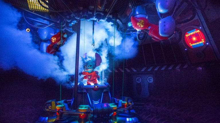
The ride is a lazy re-skin with really poor pacing, and the shoulder restraints don’t add anything to the ride anymore, so they’re just in the way. Also, Stitch burps chili dogs or something in your face and it’s horrible and makes everyone want to throw up and it’s bad.
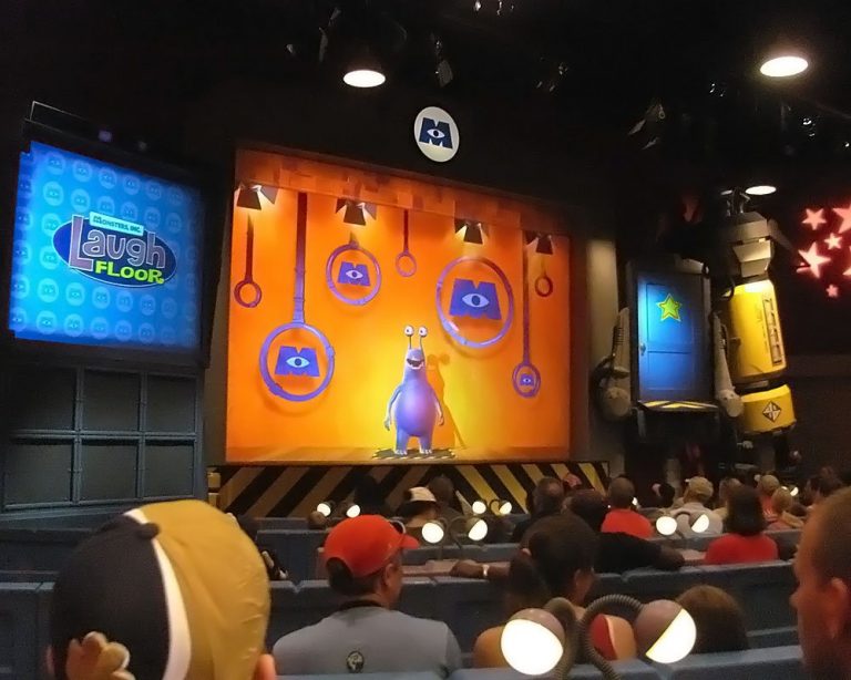
The Timekeeper was replaced by Monsters Inc. Laugh Floor, a comedy show using a performance-capture system for live actors/CG models. Impressive tech, but Monsters Inc. has no business being in a future/sci-fi section of the park, and is DEFINITELY lacking the soul of Timekeeper.
(The worst part about this one is that Monsters Inc. has vaguely art deco elements to it as a film, which could have integrated SUPER well into 1994 Tomorrowland, but… again, Iger-era Disney).
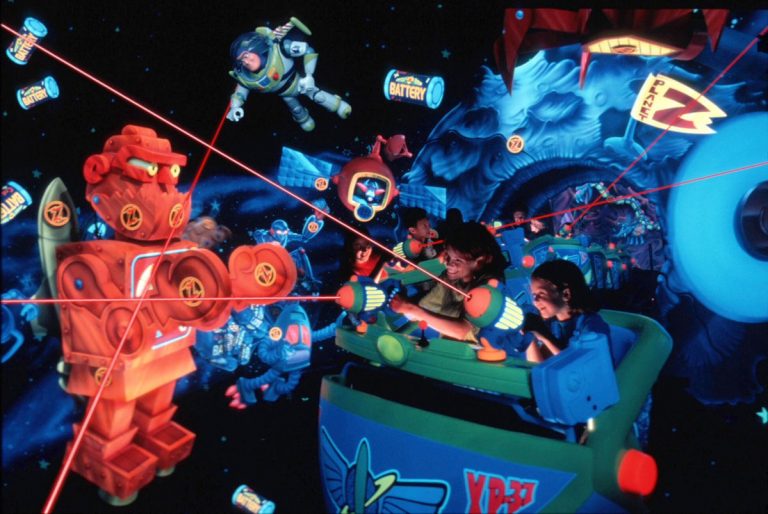
Buzz Lightyear’s Space Ranger Spin replaced Delta Dreamflight/If You Could Fly, another holdover from old Tomorrowland, and honestly is the best Disney IP fit in Tomorrowland. It’s a super-fun light gun ride. I don’t really have a beef with this one.
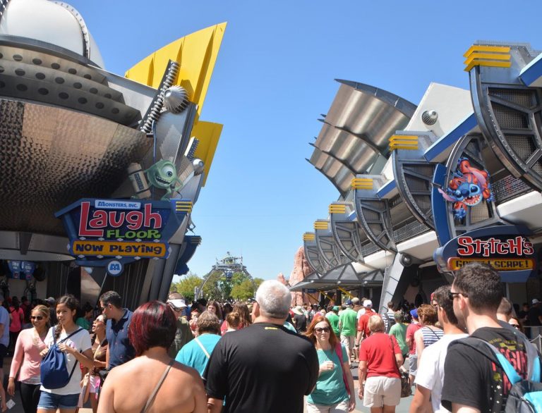
These new attractions all have one thing in common: they threw off the thematic balance of Tomorrowland. No regard for font, no regard for color palette, little to no regard for architecture. As is the case in most Iger-era expansions, loyalty to IP trumps park theming.
1994 Tomorrowland continued a message set forth by the original – that the future is sometimes scary but we can make it okay. Disney doesn’t really care anymore. The IP-based rides and shows contribute nothing to that, so the land feels aimless, muddled, aging.
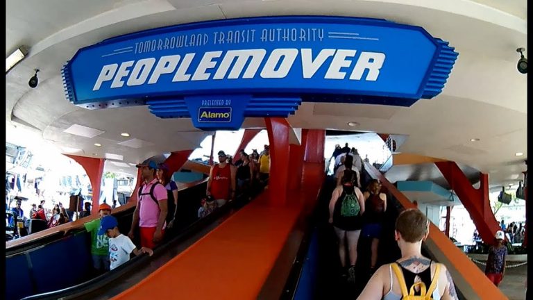
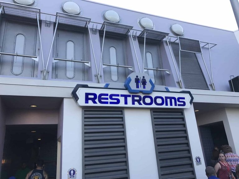
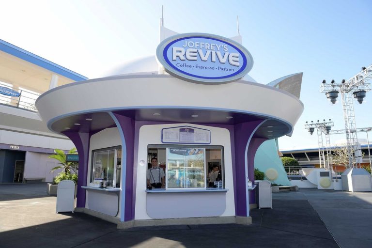
Future signage didn’t keep to the color palettes or aesthetic much at all, either, despite some of the fonts being retained. They kinda default back to pre-1994 Tomorrowland, which isn’t OFF-theme, per se, but definitely breaks the design.
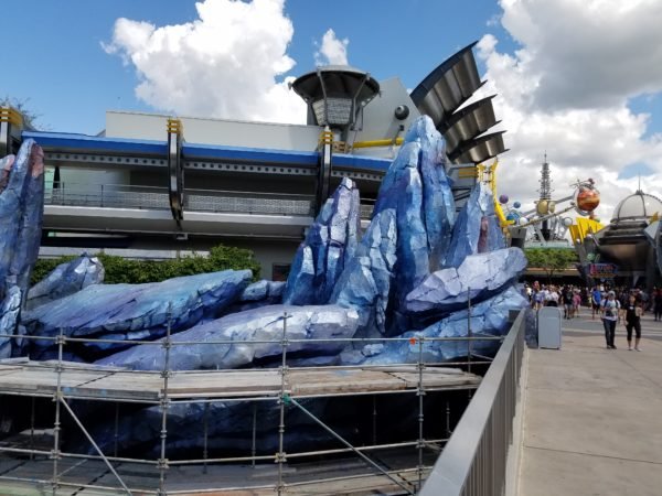
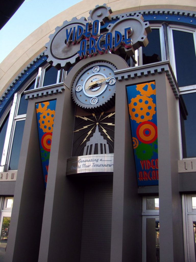
Modern Tomorrowland displays the same symptoms as Epcot, California Adventure, Hollywood Studios, Celebration, FL: a park that was built by people who had a vision and maintained by people who didn’t.
Breakdowns to non-ride theming are common. It’s kinda falling apart. Buildings are empty.
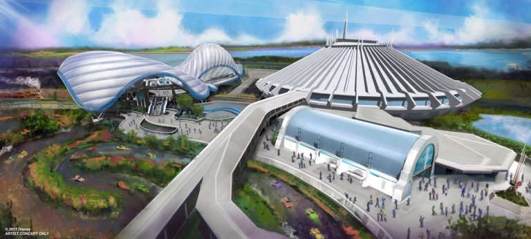
Recently, Disney revealed plans to build a Tron coaster in Tomorrowland. Not a bad fit, but there’s gonna be some visual facelifts coming with it. They’re not really that encouraging. A stale, uninspired, Apple glossy white. Corporate. Consumerist, even.
I know it’s ironic to call something at Disney World consumerist as a pejorative, but 1994 Tomorrowland definitely had some anti-consumerist skepticism in its design (PARTICULARLY with Alien Encounter). It’s a thing that DOES happen in Disney Parks, believe it or not.
Ultimately, it feels as if Disney Parks have gone from design-trendsetters to design chasers, building land after land of hit franchises in sometimes naive hopes that they’ll maintain relevance for decades (A V A T A R) instead of pursuing original vision.
In conclusion:
Enjoy what’s left of 1994 Tomorrowland while you can.
Bob Iger – Retire.
Epcot – You’re next.
You can find Max Kreiger on Twitter at @MaxKreigerVG. Check out his CROSSNIQ game at crossniq.com. CROSSNIQ is a “y2k”-flavored puzzle game that combines the logic of a Rubik’s cube with the simplicity of a match game! Players use their mouse, finger, or gamepad to line up tiles into “crosses” – an intersecting full row and full column of the same color – to clear them from the screen, earn points, and refill the play timer.
CROSSNIQ was released for free on November 20th, 2017. You can play it here in your browser now: http://www.crossniq.com.
A fully-realized version of the CROSSNIQ, with more modes and features, soon to be Kickstarter for PC, Mac, Linux, and maybe even the Nintendo Switch! While CROSSNIQ only offered one single-player mode, mode, CROSSNIQ+ will offer at least four, including multiplayer, while bringing the presentation and featureset up to par for a digital console release.
The Kickstarter for CROSSNIQ+ is going live on February 5th, 2018 – follow @CROSSNIQ on Twitter or http://www.facebook.com/crossniq for more news and updates!


Another infuriating editorial with jabs at Disney executives as if that never gets old. What’s so forward looking with steampunk and Jules Verne, who is an author and not a designer. You cited Factory Pomo and Retro as if Disney is original in using those themes. You’re triggered by the design of the new Tron ride and managed to say it’s Apple’s fault.
Tomorrowland never held up in any remodel in any era. Best to give up on it. It’ll always look half baked and in need of another makeover. The classic look was the original version of all white, which you now credit to Apple. I would prefer they stick to the Tomorrowland movie aesthetic of white, glass, and silver. Hmmm. That describes the new Tron ride. Carry on.
I always know better than to come to the comments, but here I am again.
Congrats on properly identifing Jules Verne as an author. However, reading 20,000 Leagues, you will find how Verne went into GREAT detail when describing the aesthetics. I’m going to guess that you haven’t visited Tokyo DisneySea and move on.
He didn’t credit Disney with creating Factory Pomo. He said they were major “propagators.” I know. It’s a big word.
He also didn’t say anything is Apple’s fault or give them credit. He simply referred to the color of the Apple logo.
You are free to carry on, but you may want to find out who pissed in your Corn Flakes.
I went to Tokyo DisneySea. So your point is? I wish you had a point.
The rest of your rebuttal had no point either. What’s wrong with you?
So you agree with the editorial or disagree with me because?
No love for the fired trash collector who kept the land space art deco clean for years. You only care about the elitest newspaper guy who barley even worked
push my wife & I miss you !!!!! those jerks didn’t renew your contract